
How to create architecture diagrams from code in Jupyter Notebook
As usual, I'll be running this notebook inside the comfort of VS Code. In this post, you will get instructions on setup and basics of writing code that generates diagrams

Hello world,
Recently I was working on ERD diagrams for a client and we were discussing what tools to use. I started looking for solutions available around software design diagramming. There are many tools out there that can get your work done. For the actual ERDs, we settled on using the famous draw.io. However, in this article, I’ll demonstrate how we can create other cool architecture diagrams from code. Here is one such diagram:

Setup
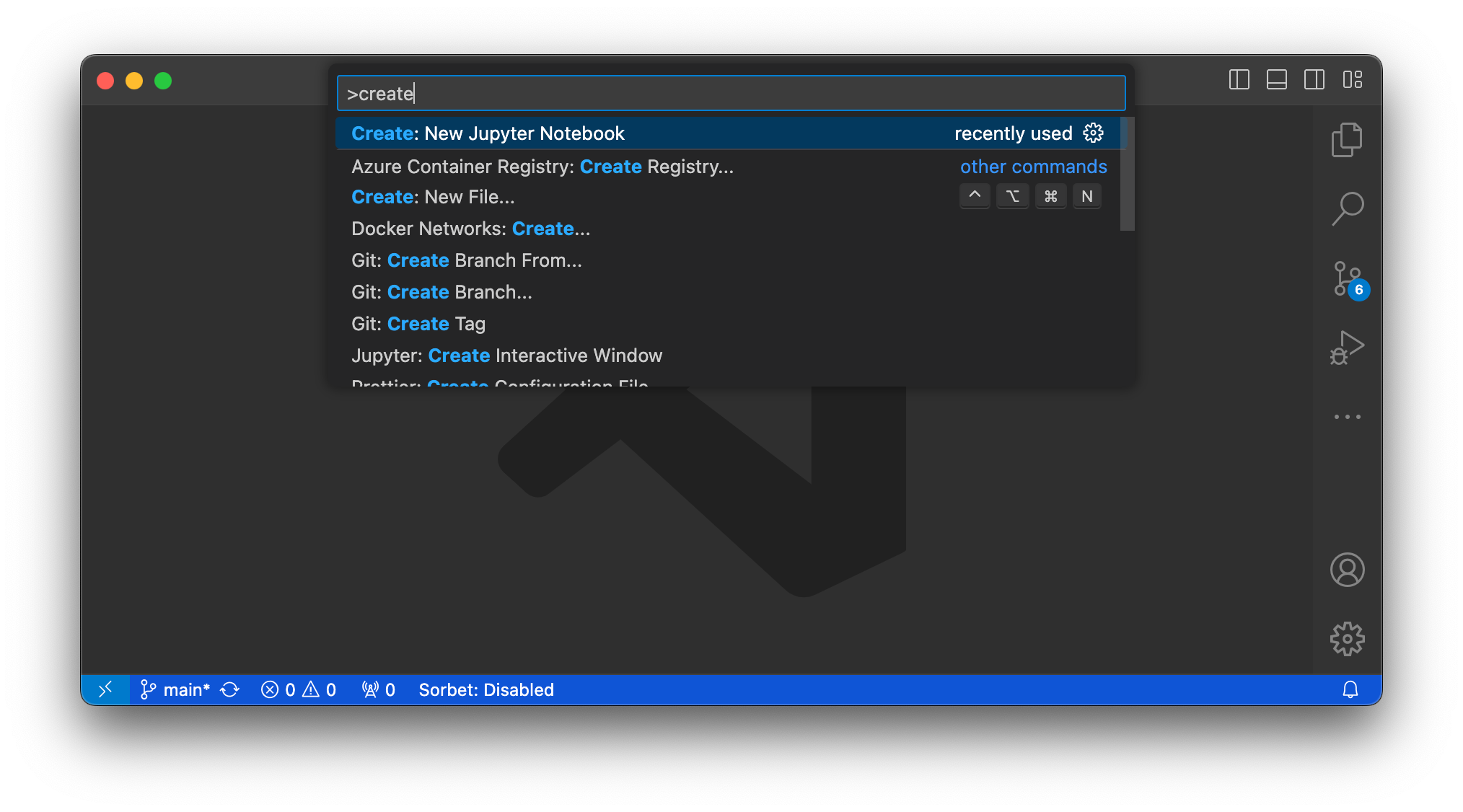
Let’s start with the basic things needed to create diagrams. Open up your VS Code and create a new notebook Cmd+Shift+P → Create: New Jupyter Notebook
We will be using Python package diagrams. Let’s install that
%pip install diagramsIn Jupyter, if you want to execute a shell command, you can start it with % as shown above. Alternatively, you can run the command in your terminal directly without %. So it will be `pip install diagrams`
🧑💻 On the macOS, you may need to install Graphviz. You can do that through the brew
brew install graphvizThis installation took a while for me. After everything was set, I could head back to Jupyter Notebook.
Code To Diagram
In Jupyter, let’s create a new code cell and add the following:
from diagrams import Diagram, Cluster
from diagrams.aws.compute import EC2
from diagrams.aws.database import RDS
from diagrams.aws.network import ELB
from diagrams.onprem.inmemory import Redis

with Diagram("Web Service", show=False) as diag:
    with Cluster("Compute"):
        web_1 = EC2("web 1")
        web_2 = EC2("web 2")
    ELB("lb") >> [web_1, web_2]
    web_1 >> RDS("db")
    web_2 >> Redis("cache")

diag
Here is the GitHub gist link for the same.
Hit the run button next to the cell and it should produce the output image. This image will be rendered in your Jupyter Notebook itself and the actual image file will be on your disk (in the same folder as that of the notebook)

You can play around with this. Refer to examples of the diagrams on their website and check out the source code on GitHub.
Here is one more diagram that I made for one of the projects.

You can find the source codes for that on GitHub.
Overview Of Concepts
There are three main concepts that we used here:
Nodes
Clusters
Connections
Nodes are graphical representations of your components. They are importable for many different cloud providers as well as generic ones. In our example, we used Nodes from AWS and OnPrem.
Clusters are groups that have their background, frame box, and label. Nodes defined inside the context of a cluster appear together.
To establish connections between nodes, we use >> and <<. They will make a directed Edge from one node to another. You can also make arrows from one node to a list of nodes.
However, it is not possible to make list-to-list connections. That is a limitation on Python side. So let’s make it in Ruby for the improved happiness. I’ll give it a thought.
You should explore the complete list of Nodes available. Also, you can add your images and create custom Nodes.
👋🧑💻 That’s a wrap. Let me know how you find this article. Your feedback will help me write better and hopefully provide you with more value. Happy coding.